Domestique Coffee
Specialty Coffee Shop, Cart, and Micro Roaster in Madison, WI
Project scope
Full brand refresh
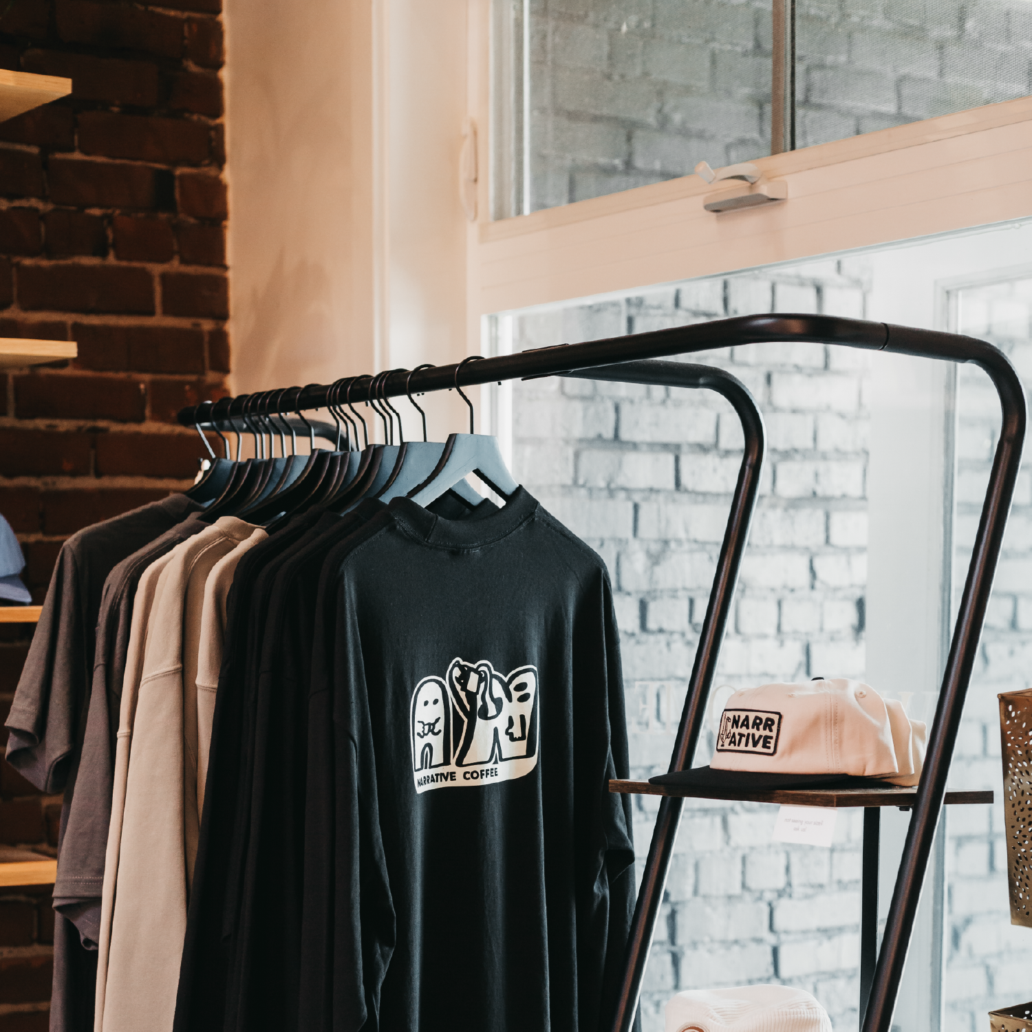
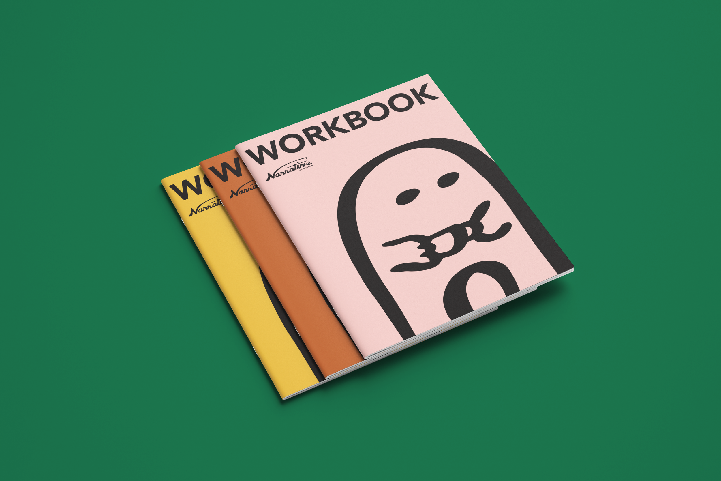
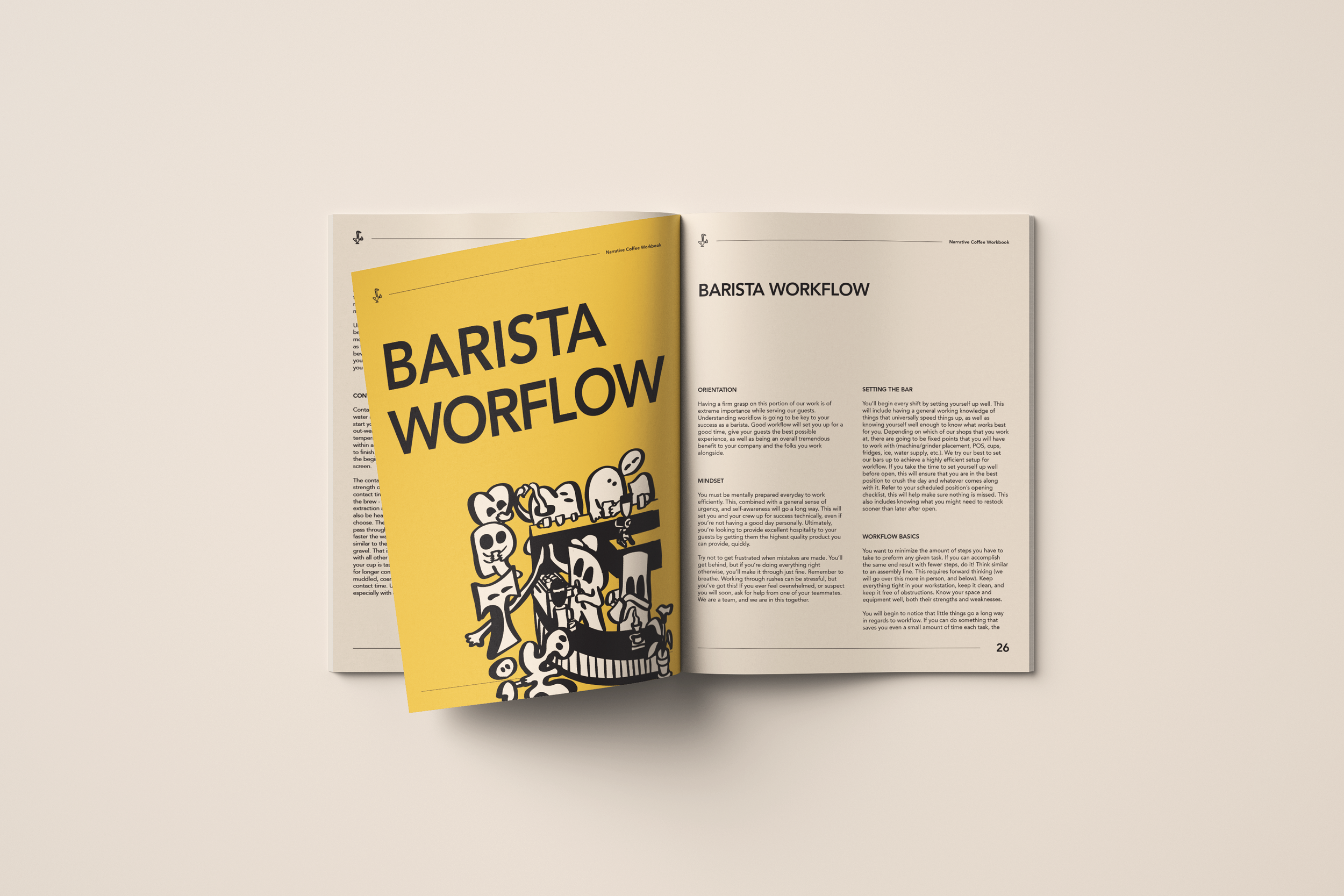
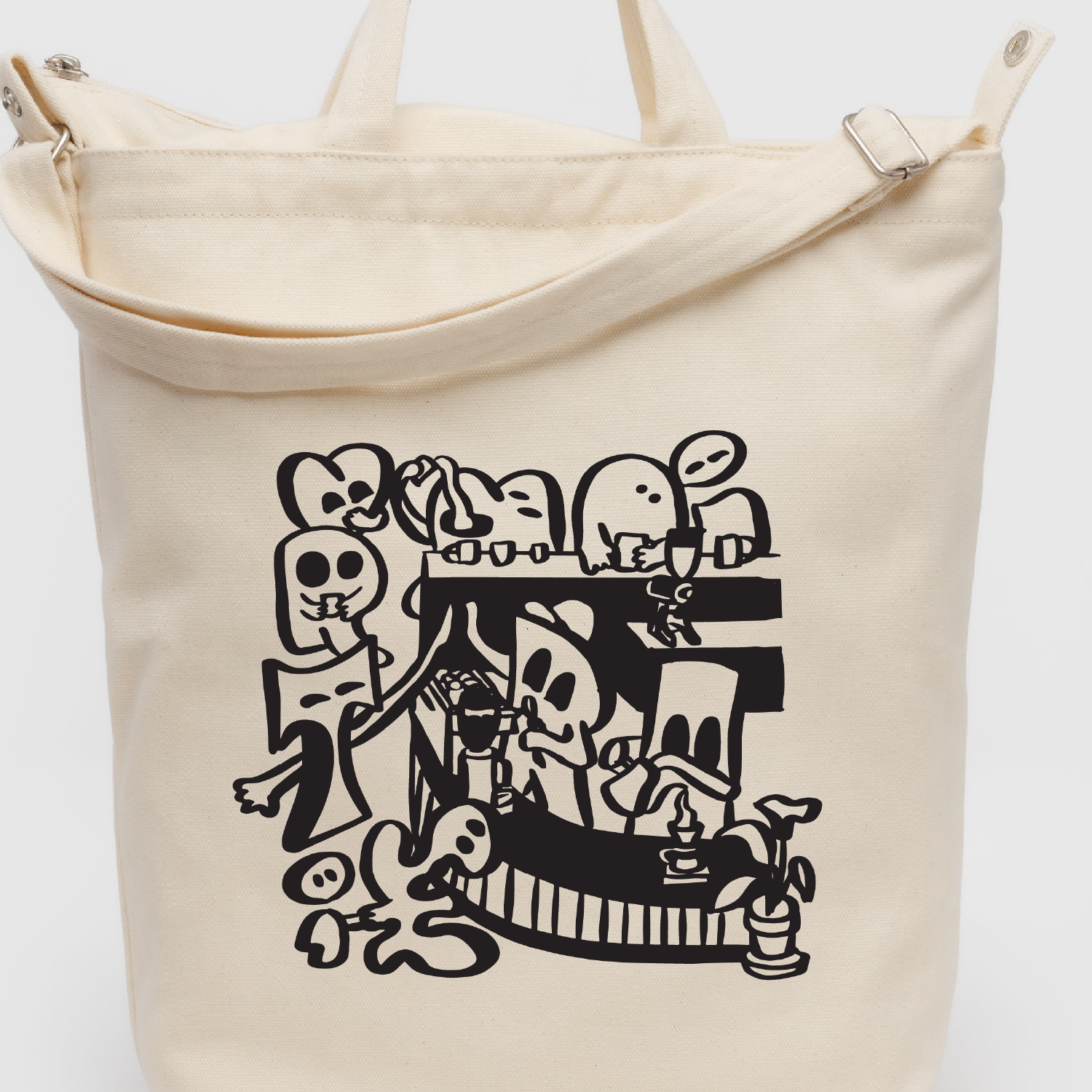
Merch designs
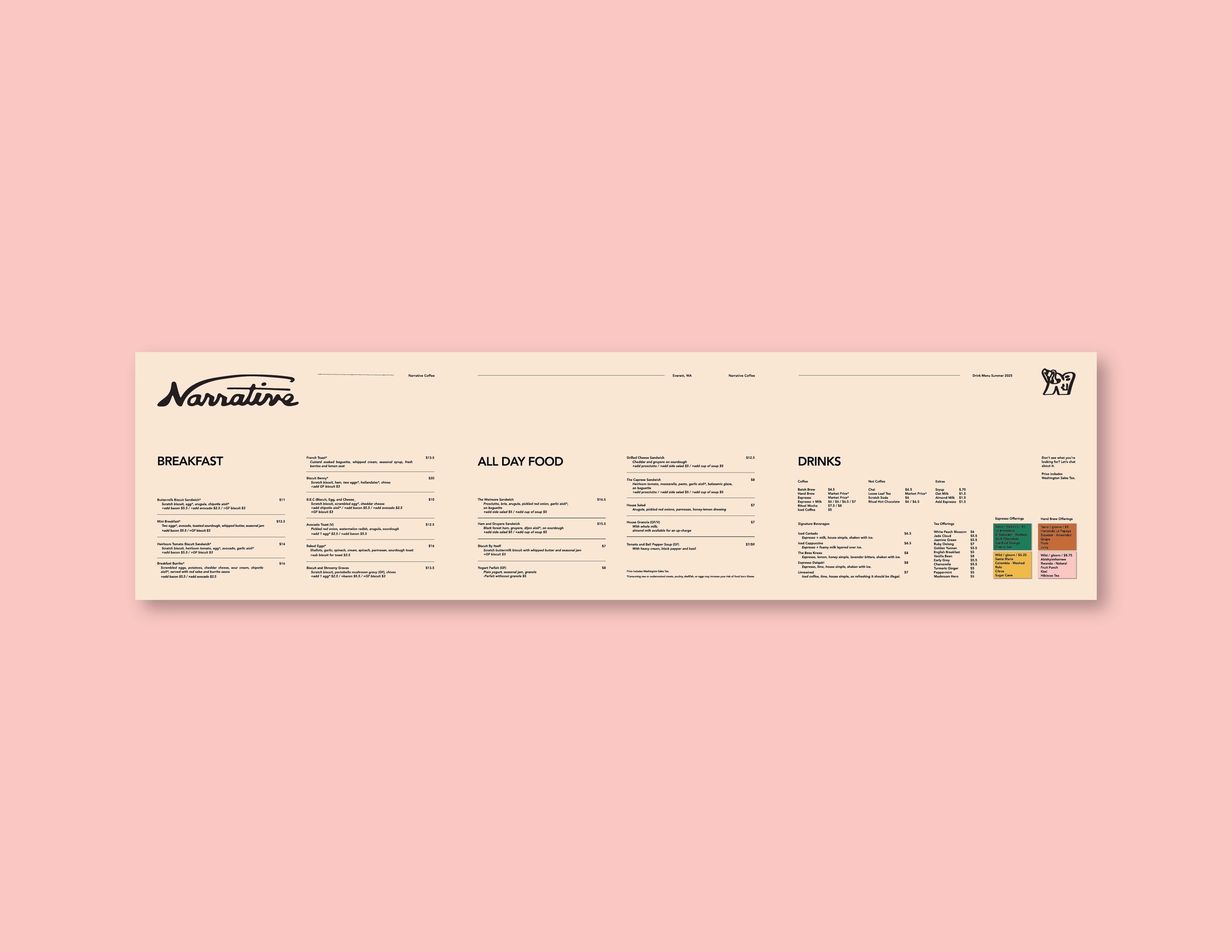
Cafe menu
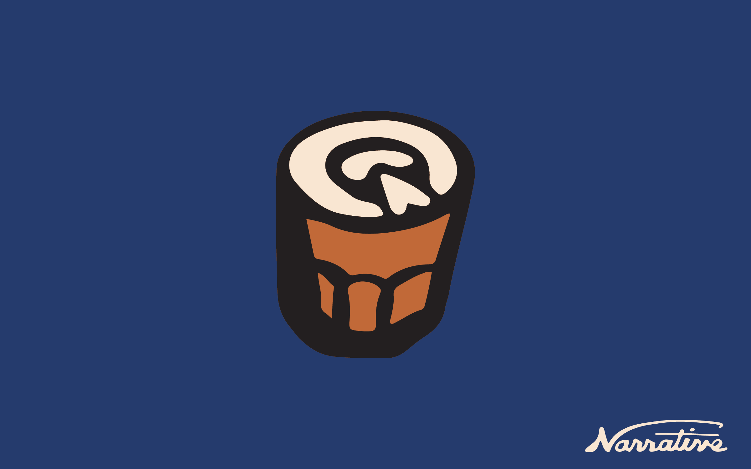
Coffee Can Designs
Brand Introduction
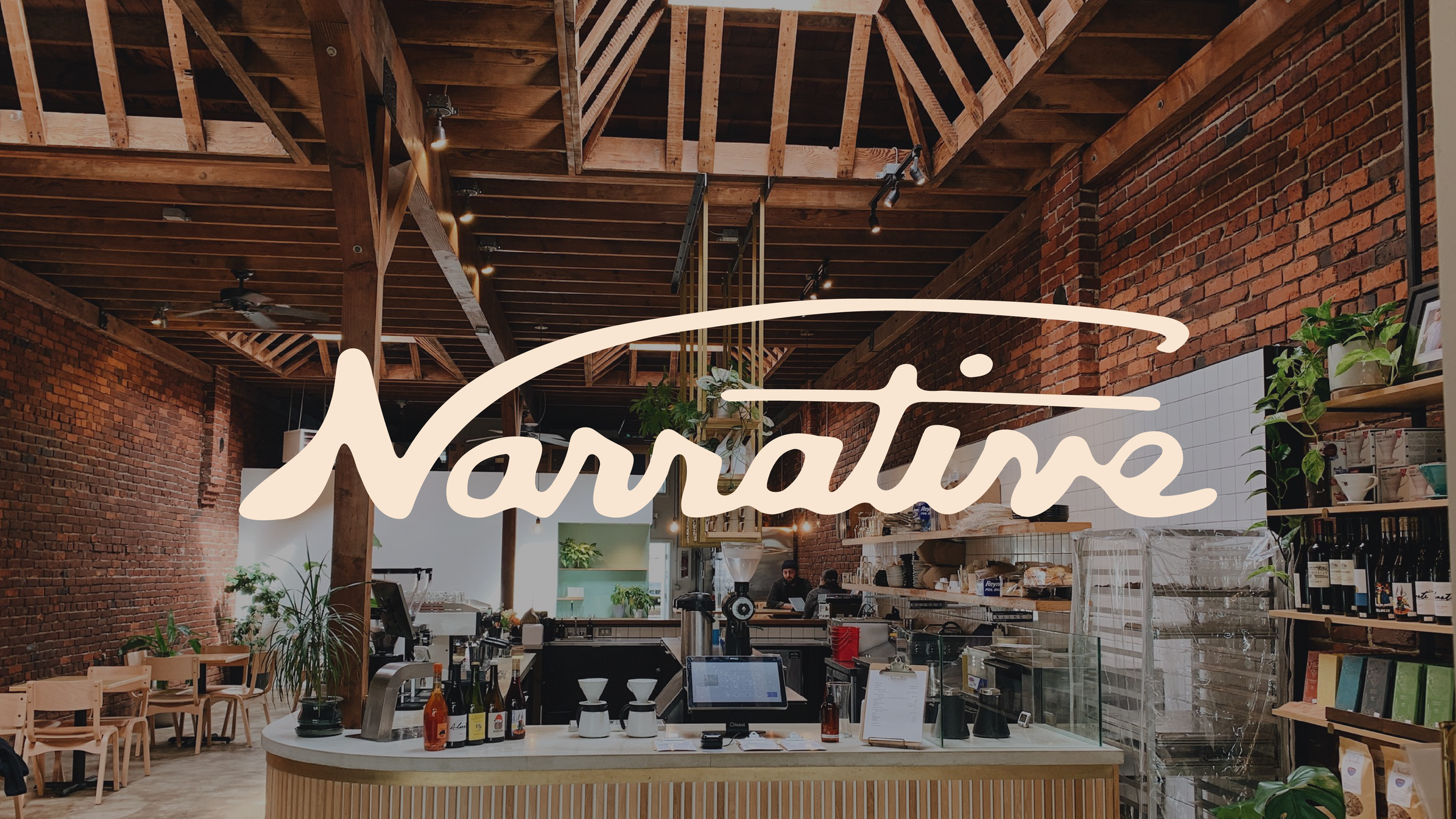
We worked closely with Alex Sciarratta at Narrative to refresh the branding for Narrative Coffee. Narrative is probably one of the best cafes in the world, no lie. They serve the best of the best coffee roasters, they house world champion baristas, and best of all– they’re incredibly welcoming and kind. We wanted to make their branding feel extremely approachable while maintaining a strong sense of excellence.
PROCESS PHASE 1
Exploration
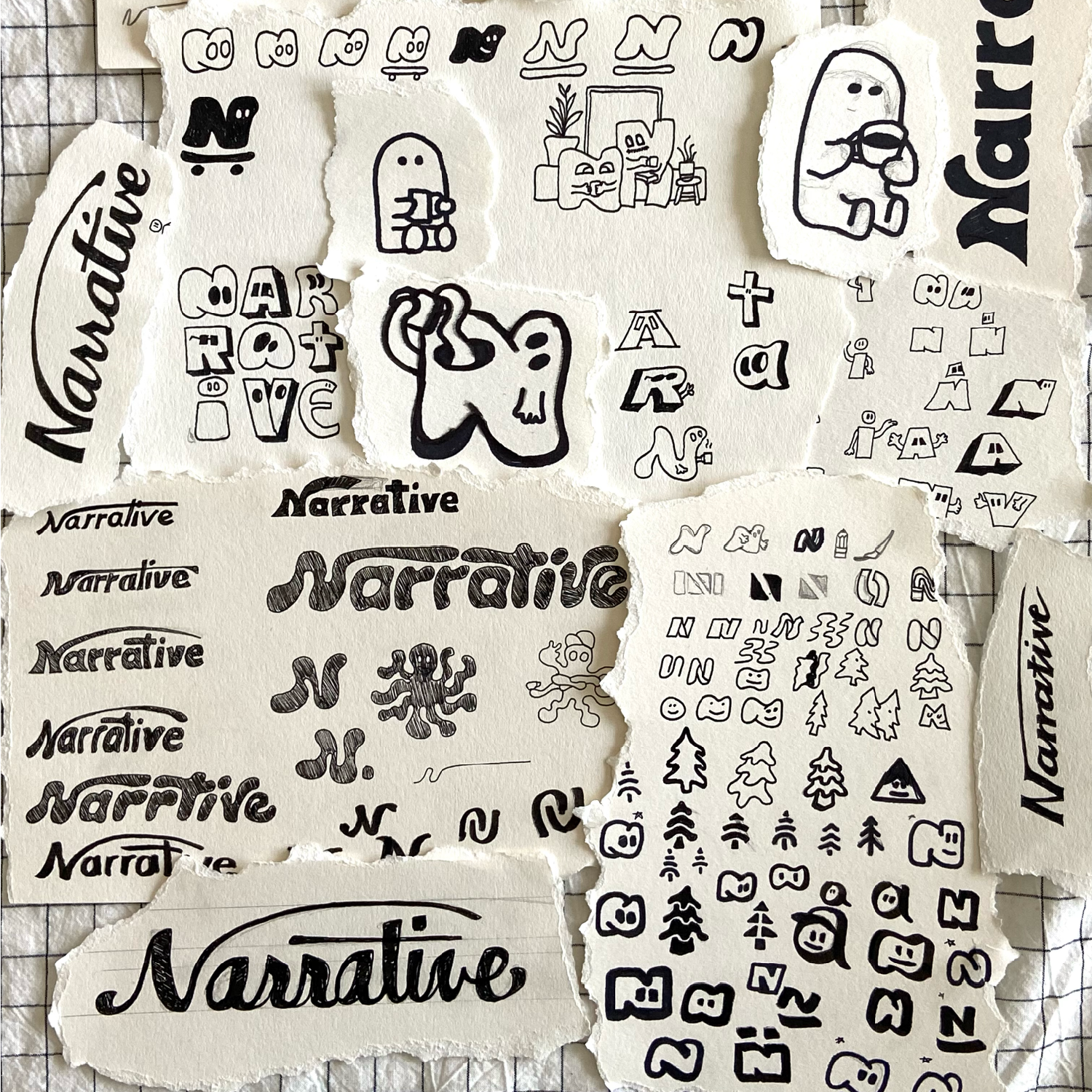

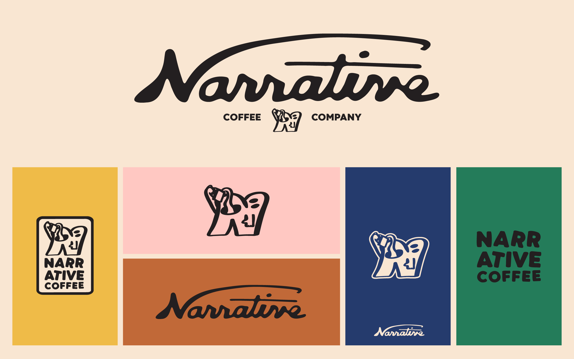
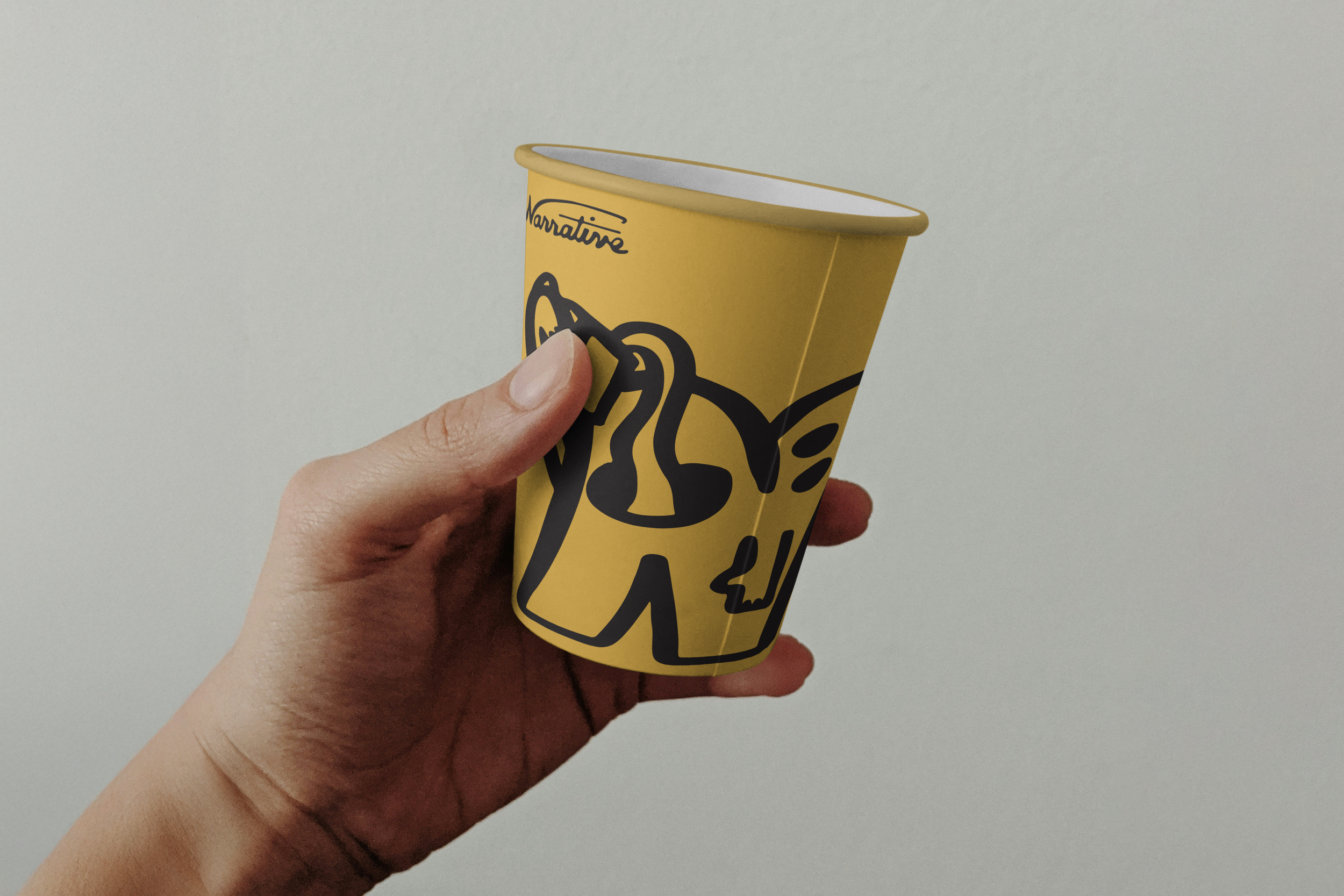
It was pretty tough to strike the balance between unforgiving fun and unwavering excellence, but I think we did it. We created a word mark that relates strongly to their original; a beautiful cursive typeface that feels classy yet hand made. We then went through a ton of logo mark ideas… eventually landing on one that represents the team at Narrative the best: an N character guzzling a cup of coffee.
PROCESS PHASE 2
Word Mark
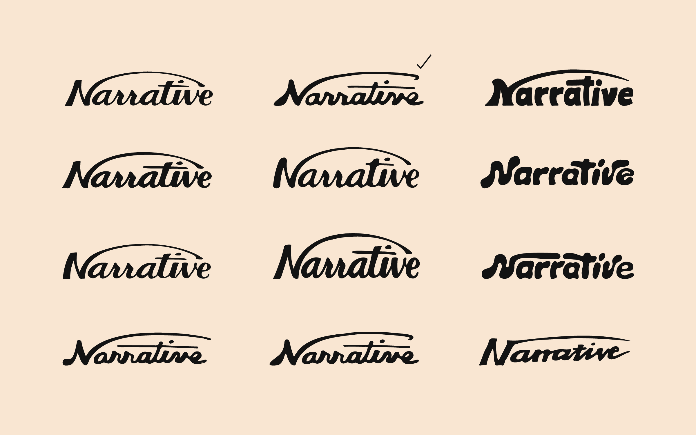
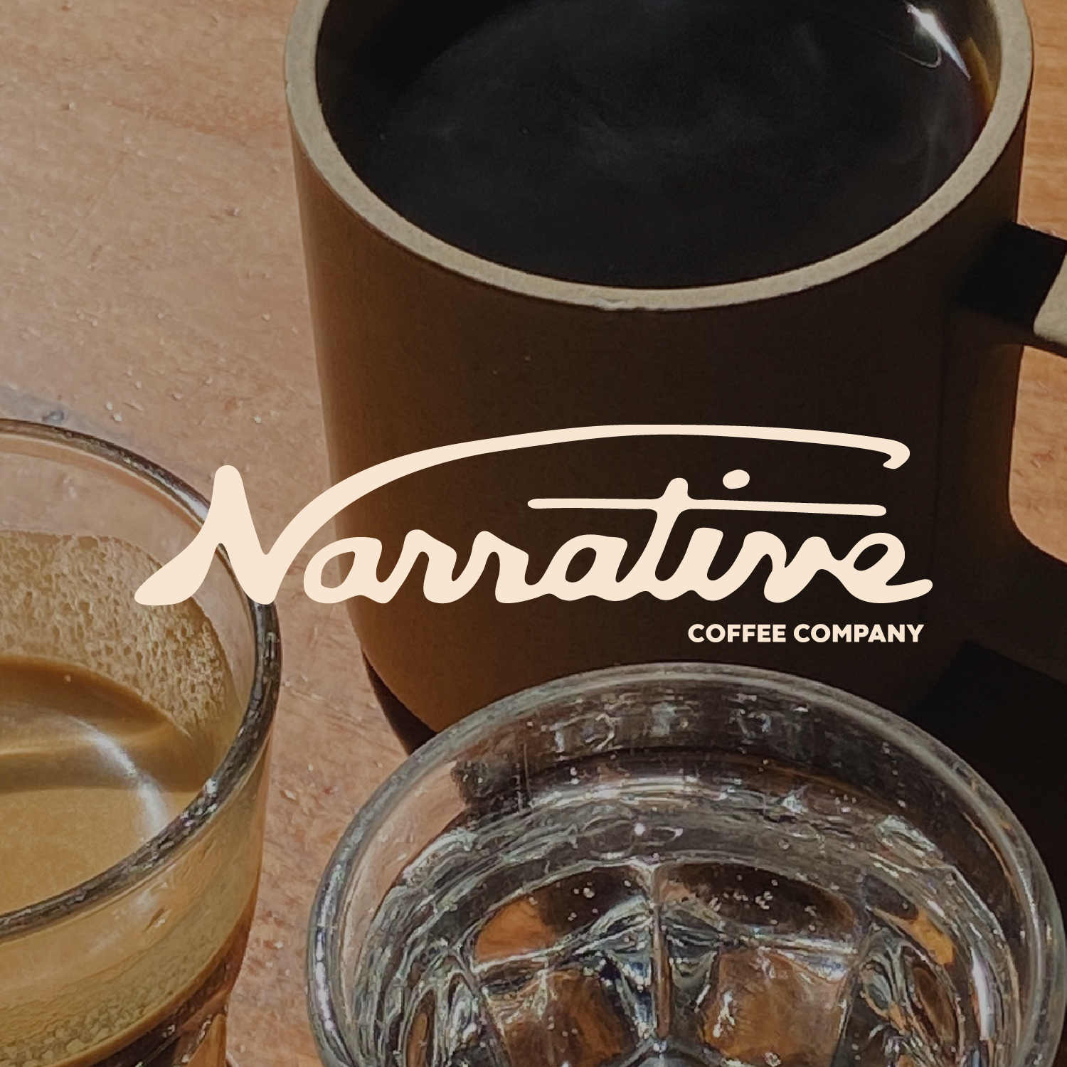
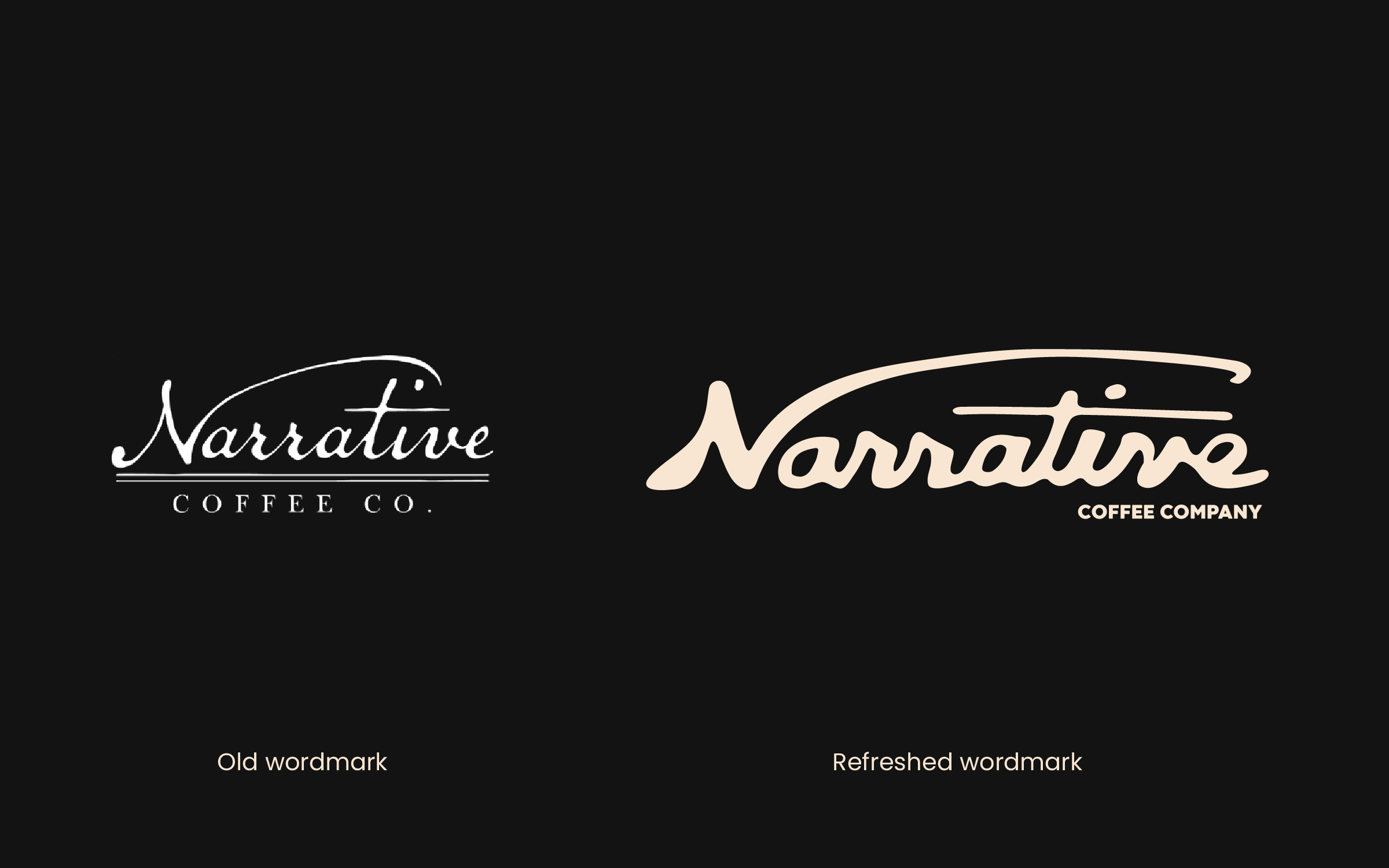
Unsurprisingly, the word mark also took quite a bit of trial and error. We knew we wanted to stay pretty close to the original word mark (as that was literally all of the visual branding Narrative had at the time) but we also wanted to give it a light hearted face lift. We felt like the old word mark definitely conveyed a sense of excellence but was lacking much personality beyond that. I hit the paper with sharpie and came up with a bunch of word marks that didn’t quite feel right, but after enough tries we got it. I personally love this word mark. I think it does a beautiful job marrying excellence to play.
PROCESS PHASE 3
Logo Mark
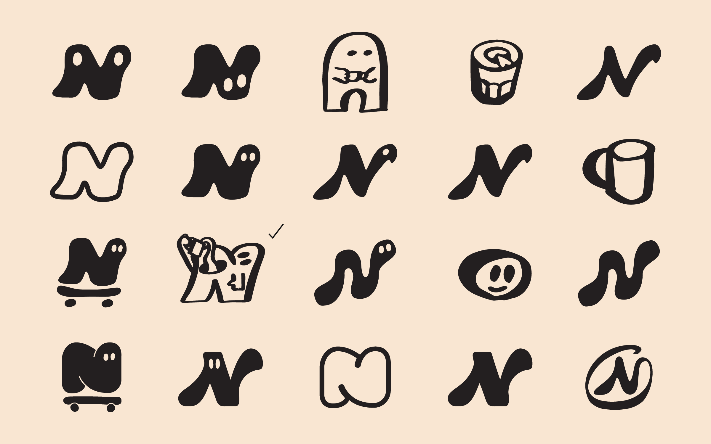
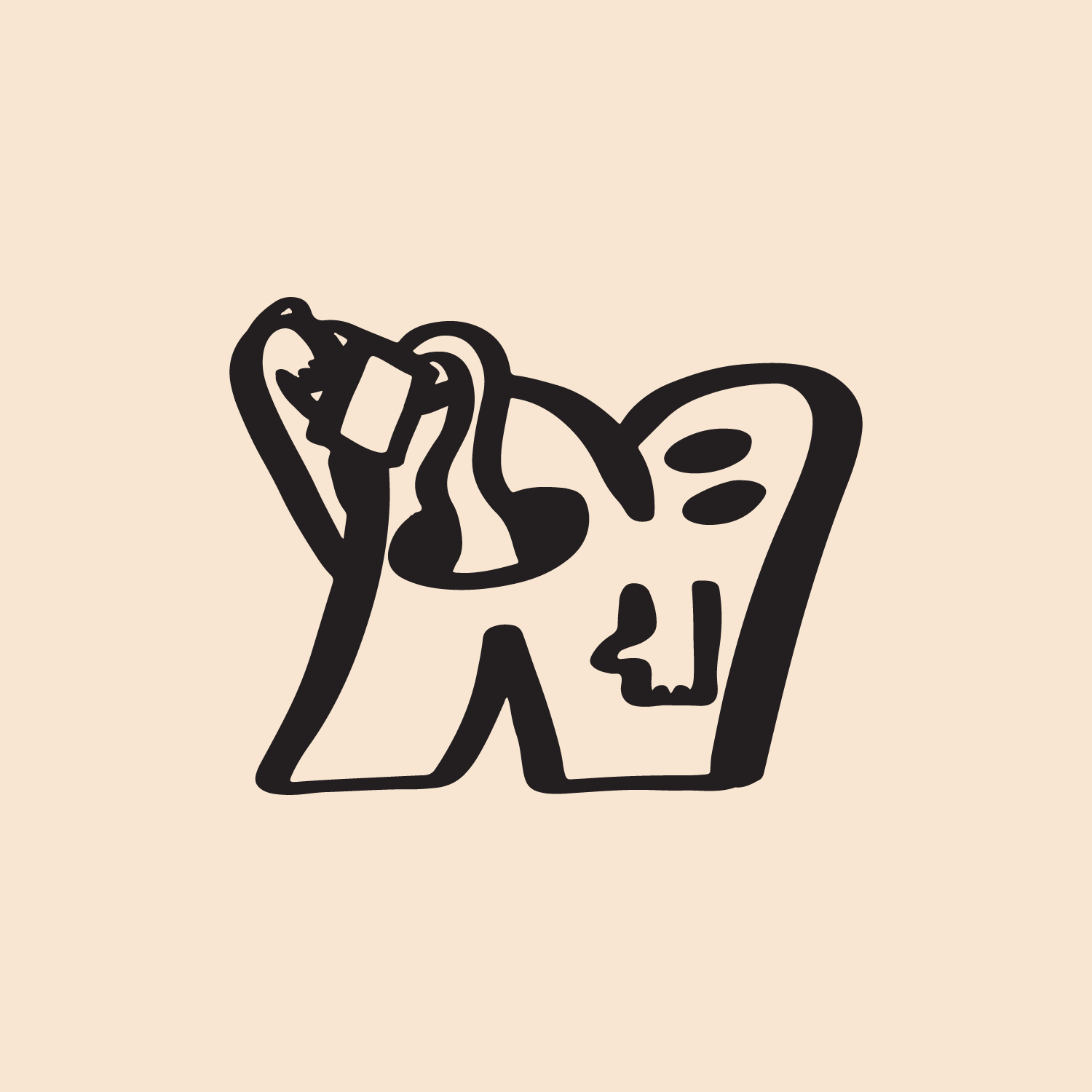
It took a lot of effort to get the logo mark down. It was actually one of the last elements of the visual brand that we landed on. I pitched a lot of refined and minimal logo marks to Alex but nothing started to feel right til we got to these alphabetical characters. Once I understood they were really leaning into the fun component of the brand for the mark, I came up with this N guy downing a cup of coffee and it landed perfectly. It works with the word mark mostly because both are drawn with a permanent marker and then refined digitally. The inconsistent line work makes them feel related even though the mark is far more fun and the word mark is slightly more serious.
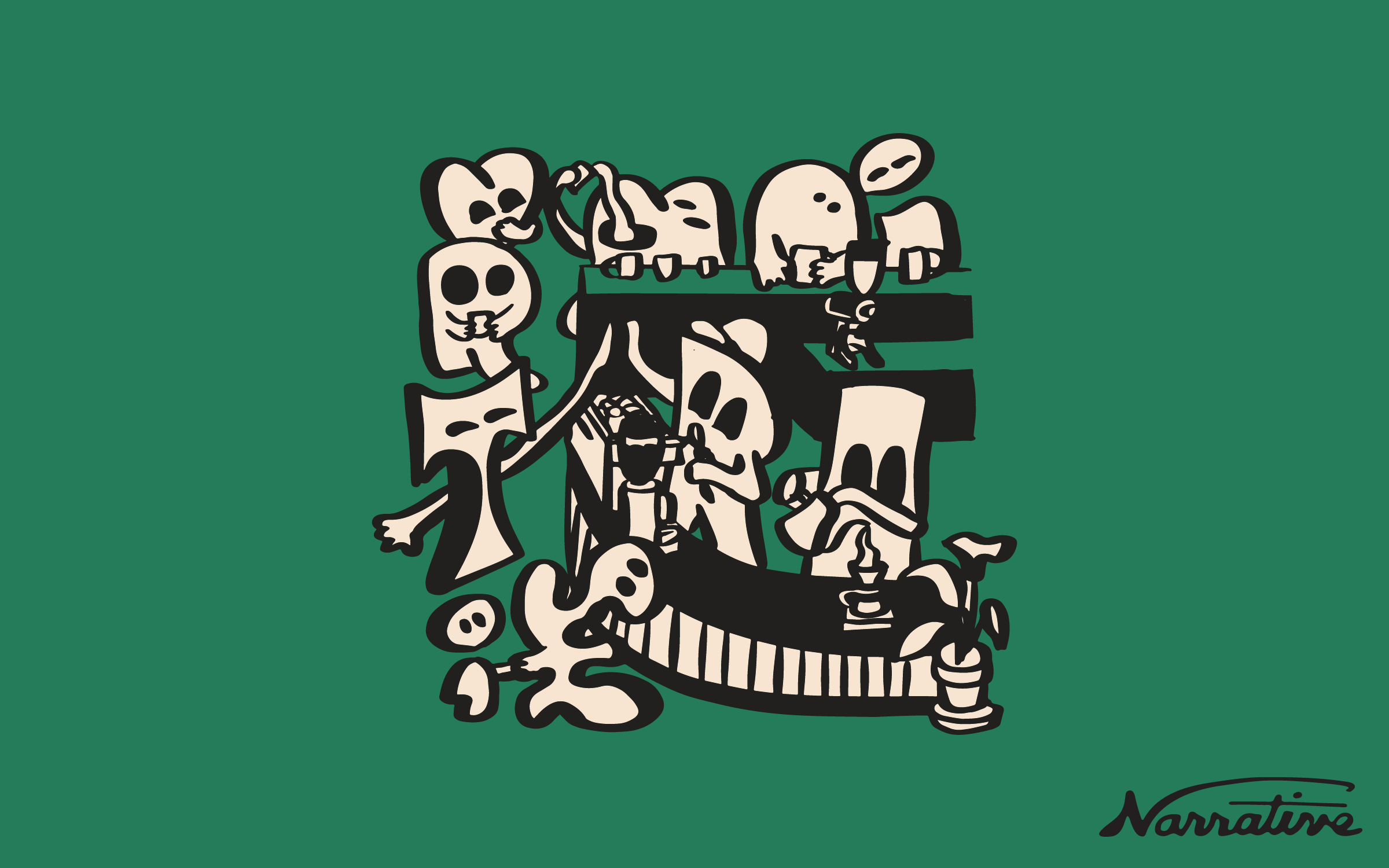
FINAL BRAND ASSETS AND ARTWORK